
Why Do Some Colours Wash Me Out?
Understanding the real reason certain shades drain you — and how colour analysis brings everything into harmony.
Most women know the feeling. You try on a top you love — the cut is perfect, the style is perfect — but the moment you look in the mirror, something feels… off. Your skin looks dull. Your eyes look tired. Your face loses definition. You look washed out. It’s not you. It’s the colour.
Let’s explore why this happens — and how understanding your undertone, depth and chroma can change everything.
🌸 1. The Colour Doesn’t Match Your Undertone
Understanding undertone Your undertone is the temperature beneath your skin — warm, cool or neutral. When a colour doesn’t match your undertone, it creates instant disharmony.
If you’re warm‑undertoned
Cool colours (icy pinks, blue‑based reds, stark black) can make your skin look grey, sallow or flat.
If you’re cool‑undertoned
Warm colours (mustard, tomato red, warm beige) can make your skin look ruddy, yellow or tired.
If you’re neutral leaning cool or warm
Colours that are too warm or too cool can pull your skin in the wrong direction.
This is the number one reason people feel washed out. The wrong undertone drains you. The right undertone brightens you.
🌿 2. The Colour Is Too Light or Too Dark for Your Natural Depth
Understanding depth Depth refers to how light or dark your natural colouring is.
If your colouring is light
Very dark colours can overwhelm your features, making your face look shadowed or sunken.
If your colouring is deep
Very pale colours can wash you out, making your skin look flat or chalky.
Depth is about balance. When the colour’s depth matches your own, your features come alive.
🎨 3. The Colour’s Chroma Doesn’t Match Your Natural Softness or Brightness
Understanding chroma Chroma describes how soft or bright your natural colouring is.
If your chroma is soft/muted
Bright, saturated colours can overpower you, making your skin look blotchy or harsh.
If your chroma is bright/clear
Muted, dusty colours can make you look dull or tired.
This is why two people can wear the same colour and look completely different. It’s not the colour — it’s the chroma.
🌼 4. Some Colours Create Shadows or Emphasise Redness
Colour harmony The wrong colour can:
highlight under‑eye shadows
emphasise redness
bring out pigmentation
make fine lines appear deeper
flatten your natural glow
The right colour does the opposite — it lifts, brightens and softens.
🍂 5. Your Season (and Subseason) Determines Your Sweet Spot
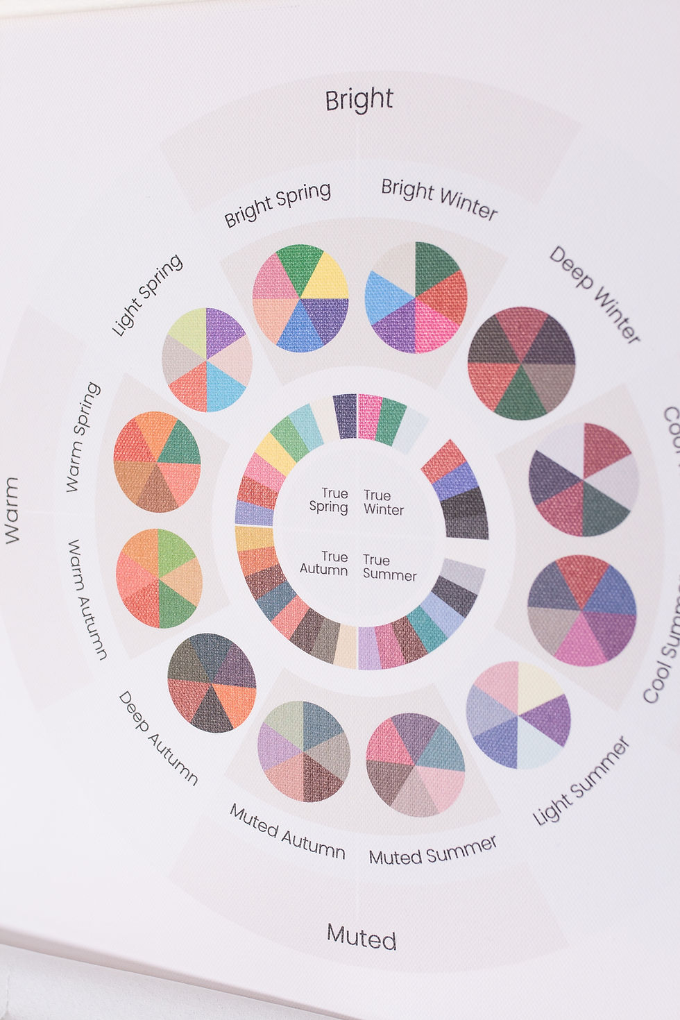
16 subseasons Your season is the combination of your undertone, depth and chroma.
But your subseason refines it even further.
This is why a 16‑subseason in‑person analysis is so accurate — it shows you:
which colours energise you
which colours soften you
which colours drain you
which colours overwhelm you
which neutrals are your best friends
And it does this by observing your skin’s real‑time reaction to colour — something quizzes, filters and AI simply cannot do.
🌿 6. So Why Do Some Colours Wash You Out?
Because they don’t align with your:
undertone
depth
chroma
When these three pillars are in harmony, you look brighter, fresher and more alive. When they’re not, you look washed out — even if the colour is beautiful on someone else.
It’s never about the colour being “bad.” It’s about whether it belongs to you.
🌸 Ready to Stop Feeling Washed Out?
If you want clarity, confidence and a wardrobe that truly supports you, an in‑person colour analysis is the most accurate way to discover your palette.
Explore the Wildflowers Colour & Style services here.


Comments